Anthony Nolan
Transforming donor recruitment through a user-centred digital experience
Reimagining how one of the UK's leading cancer charities recruits life-saving stem cell donors by combining behavioural insight, campaign strategy and experience design.
The Opportunity
Anthony Nolan relies on volunteers joining its stem cell donor register to help save the lives of people with blood cancer.
Despite strong brand recognition and successful awareness campaigns, the online registration experience was limiting conversion. The existing journey was generic, disconnected from campaign messaging and failed to engage the charity's predominantly younger audience. It also needed to attract more registrations from underrepresented demographic groups to improve the likelihood of finding suitable donor matches.
My Role
As UX/UI Project Lead, I led the user experience strategy across the programme, working closely with stakeholders to balance organisational objectives with donor motivations.
My responsibilities included:
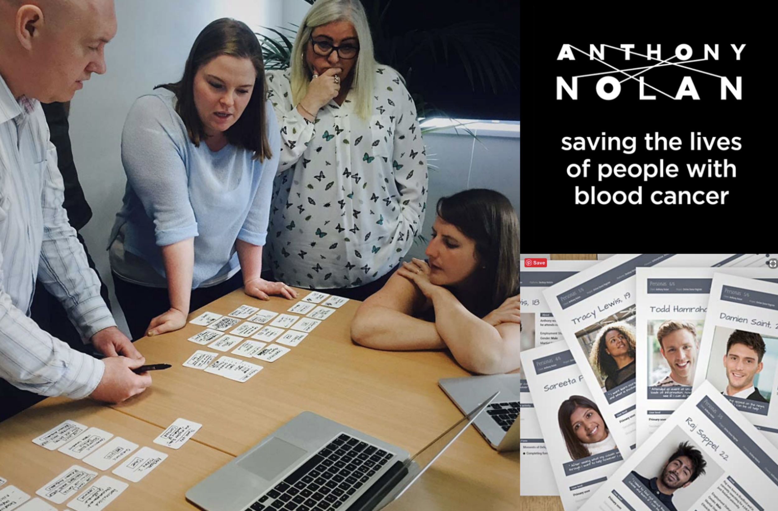
Facilitating stakeholder workshops
Leading discovery research
Defining personas and behavioural journeys
Designing the end-to-end registration experience
Creating interactive prototypes
Leading usability testing
Translating research into a scalable campaign framework
The Challenge
The project revealed three interconnected challenges.
Fragmented customer journeys
Users often arrived from social campaigns but immediately lost the emotional context that had motivated them to click.
High friction registration
The form requested unnecessary information, introduced avoidable barriers and wasn't optimised across devices.
One experience for everyone
Different audiences were treated identically, despite some demographic groups being significantly more valuable in helping patients find compatible stem cell donors.
Transforming the Experience
Rather than treating the registration form as an isolated interaction, we redesigned the complete donor journey.
The transformation centred around four principles.
1. Behaviour before interface
We began with extensive discovery workshops and behavioural analysis to understand user motivations, organisational goals and donor pain points.
Rather than assuming what users needed, we mapped goals, scenarios, tasks and behaviours before designing a single screen.
2. Consistent campaign experiences
One of the biggest opportunities lay before users even reached the registration form.
Instead of directing every campaign into the same generic landing page, we created flexible campaign journeys that maintained consistent imagery, messaging and tone from advert through to registration.
Whether someone arrived via Facebook, a celebrity ambassador or another campaign, the experience felt coherent and purposeful.
3. Design informed by evidence
Interactive prototypes allowed us to validate ideas with users before development.
Research wasn't treated as a single phase—it became a continuous feedback loop where findings were prioritised, shared with stakeholders and incorporated into rapid design iterations.
4. Smarter journeys
Rather than assuming every visitor followed the same path, we designed journeys that adapted to individual circumstances.
Even applicants who were unable to become donors were guided through carefully considered alternative journeys, ensuring they remained engaged with the charity rather than simply reaching a dead end.
Lasting Outcomes
The redesigned experience delivered measurable improvements across both user experience and organisational performance.
Better user outcomes
30% increase in users successfully moving to secondary journeys
7% increase in applicants continuing through registration following improved reassurance messaging
30% increase in applicants progressing after reducing mandatory information requirements
Improved validation reduced the number of undeliverable swab kits, saving charitable funds
Approximately 16% increase in high-quality donor registrations after launch
Industry Recognition
The programme received significant industry recognition:
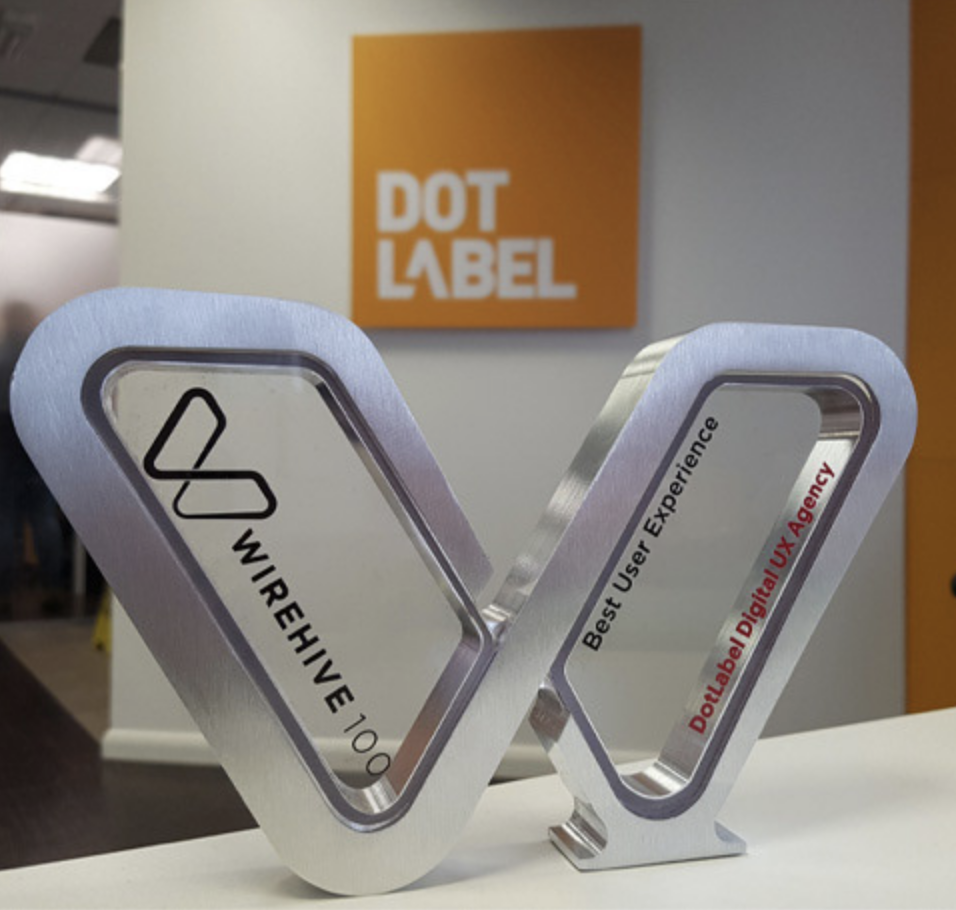
Winner — Best User Experience, Wirehive 100 Awards
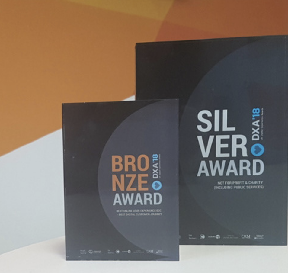
Silver — UK Digital Experience Awards (Not-for-Profit & Charity)
Bronze — UK Digital Experience Awards (Best Online User Experience B2C)
Reflection
This project fundamentally changed how I think about digital transformation.
The most valuable design decision wasn't the interface—it was recognising that conversion begins long before users encounter a form.
By designing a connected experience across campaigns, content and registration, we created a journey that felt personal, reduced friction and delivered better outcomes for both donors and the charity.